
Quiet Luxury, Enduring Materials
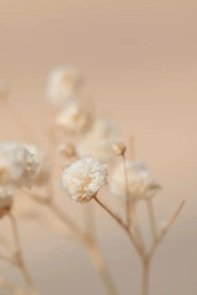
A Palette That Ages Gracefully
Tactility, Silence, and Light
Longevity Over Novelty

Selecting Marble, Limestone, and Travertine
Textural Finishes: Honed, Leathered, Brushed
Details: Vein-Matching, Edge Profiles, and Drainage
Wood: Warmth Without Noise
Metals with a Soft Luster

Living Finishes and Patina Stories

Hardware, Fixtures, and Cohesive Tone
Care, Oxidation, and Gentle Cleaning
Textiles, Plasters, and Wallcoverings
Linen, Wool, and Silk Layers for Quiet Comfort
Limewash, Clay, and Tadelakt for Breathable Depth
Grasscloth, Jute, and Natural Papers
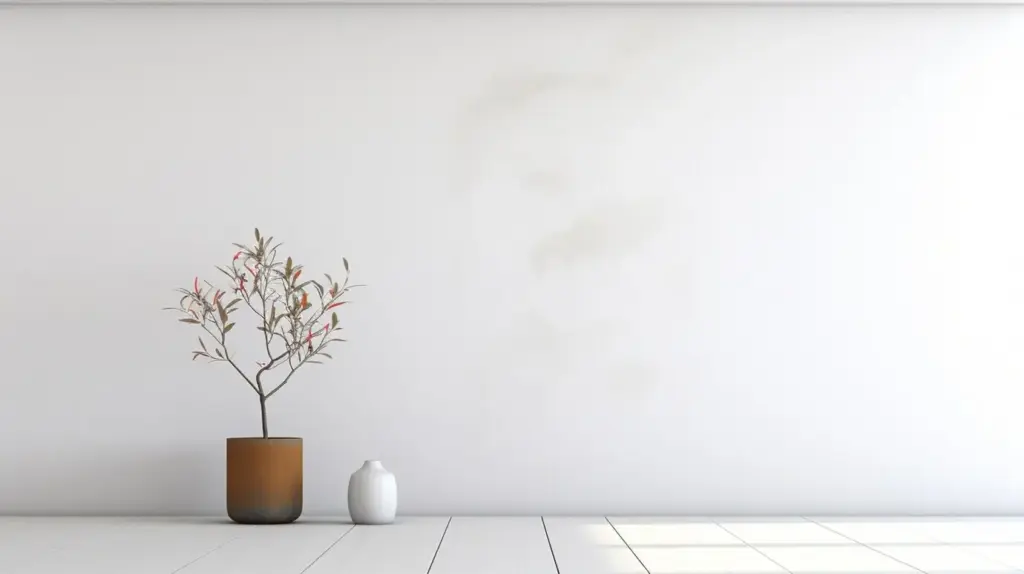
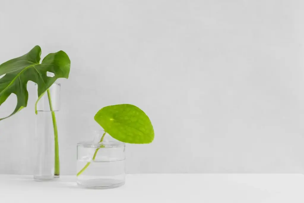
Color, Light, and Negative Space
Neutrals with Undertones and Contrast
A quiet palette isn’t colorless. Test undertones in changing light to avoid surprises—greens lurking in grays, violets in creams. Calibrate contrast so stones and woods remain protagonists. Use deep hues sparingly on interior doors or plinths to ground compositions. Subtle shifts between walls, trim, and ceilings create depth without lines, guiding the eye gently through the architecture.
Layered Lighting for Material Truth
Combine ambient, task, and accent lighting to reveal texture. Warm 2700–3000K sources flatter stone and wood; high CRI preserves natural hues. Grazing brings plaster alive; downlights should be few, accurately aimed, and often dimmable. Integrate concealed LEDs into niches and toe-kicks for floating effects. Plan control scenes—dinner, reading, late-evening—so atmosphere shifts gracefully with daily rituals.
Proportion, Rhythm, and Edited Decor
Let architecture lead. Choose fewer, better pieces with generous breathing room. Align furniture with sightlines and windows, not just walls. Repetition of materials creates rhythm, while one sculptural element introduces quiet tension. Avoid over-layering accessories; instead, curate objects with provenance. Invite participation—share your most successful edit or hardest piece to remove—and notice how clarity amplifies comfort.
Rooms That Whisper Luxury
All Rights Reserved.